When I joined Roofr, the company was in the middle of a major rebrand. The product was evolving fast, and visually, everything was shifting toward a cleaner, more modern identity.
But as time was passing and the new brand was being implemented, one page stuck out like a sore thumb: the Measurements page.
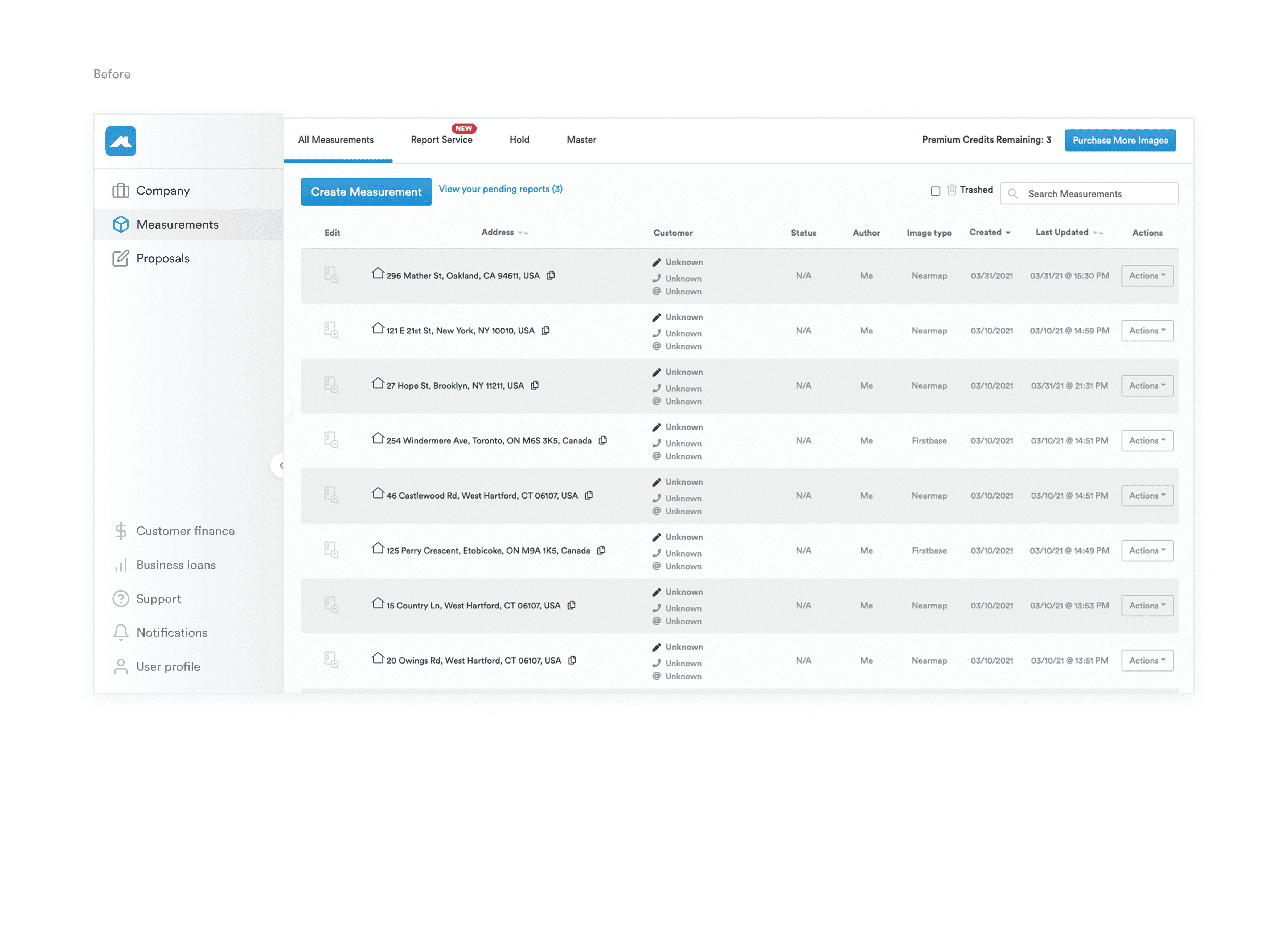
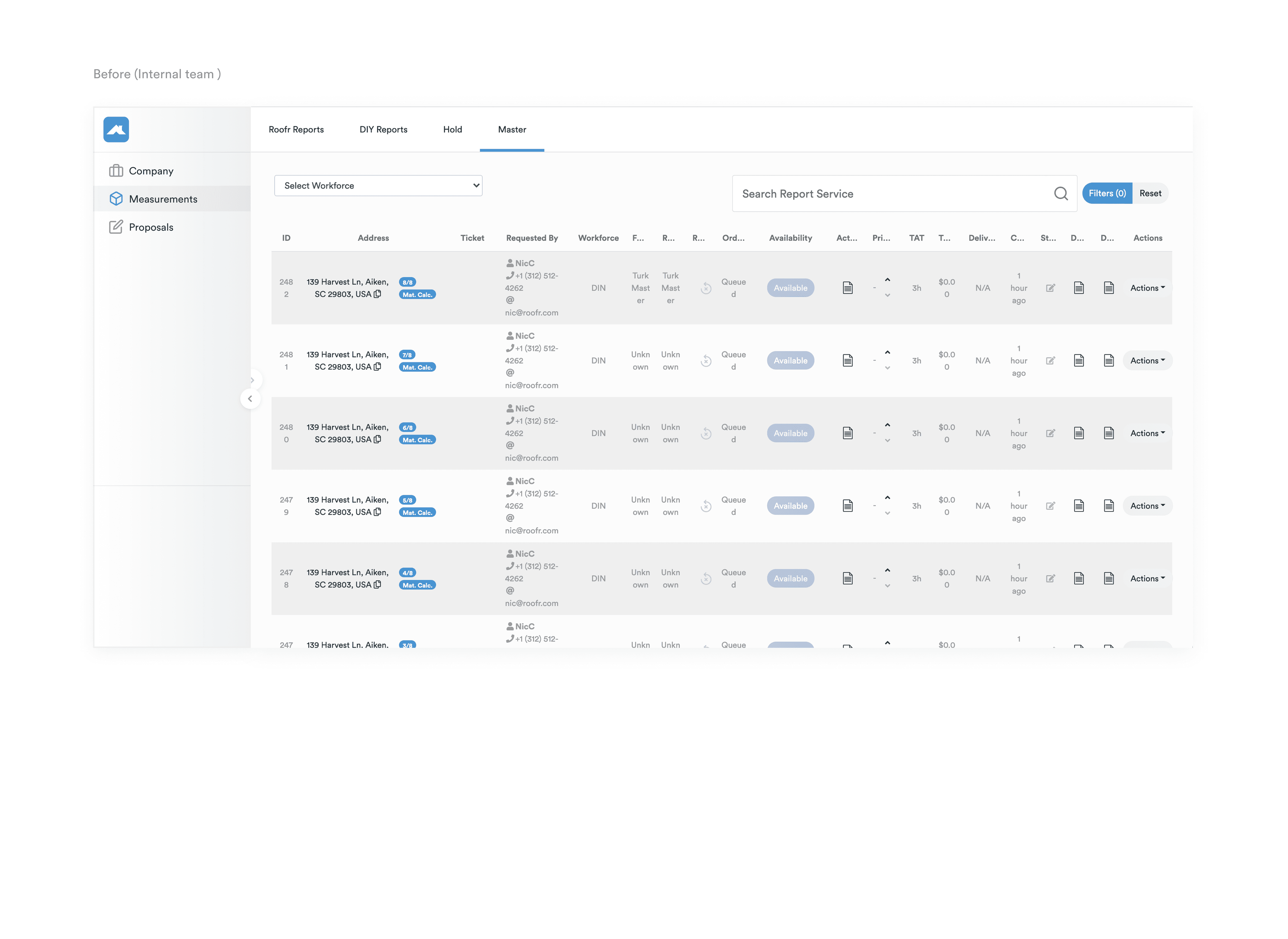
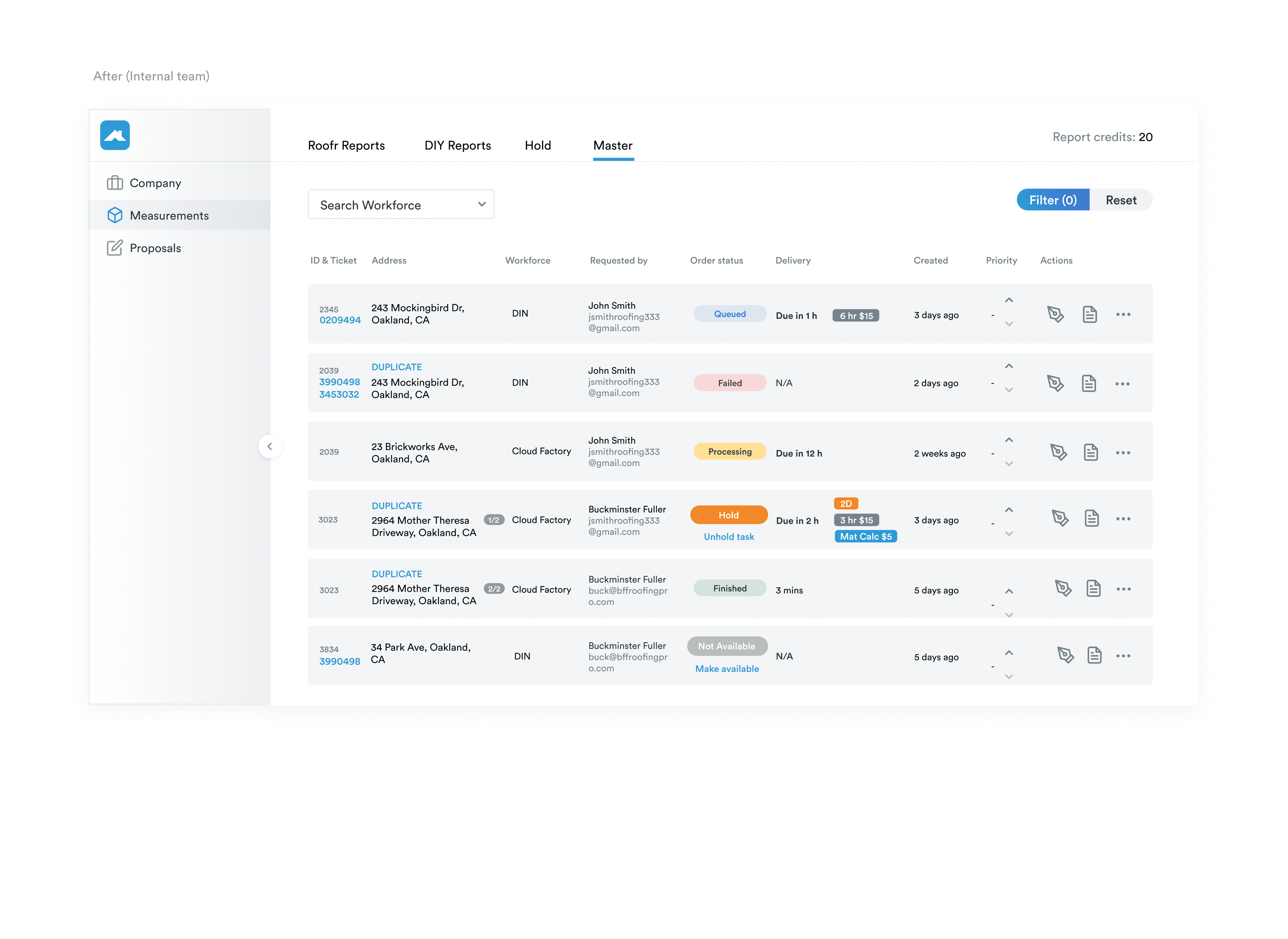
It was a core workflow—the place roofers went to view their past measurement reports and order new ones—but it hadn’t been touched during the rebrand. Visually, it felt disconnected from the rest of the product. Functionally, it was messy and overloaded. Customers were confused. Internal teams were compensating. And yet... it wasn’t on anyone’s roadmap.
That’s when I decided to do something about it.
Company
Roofr
Summary
Redesigned a key page to support 3500+ subscriptions and 150% revenue growth in under a year.
Year
2022
Process
Spotting the gaps
I started by mapping out what wasn’t working:
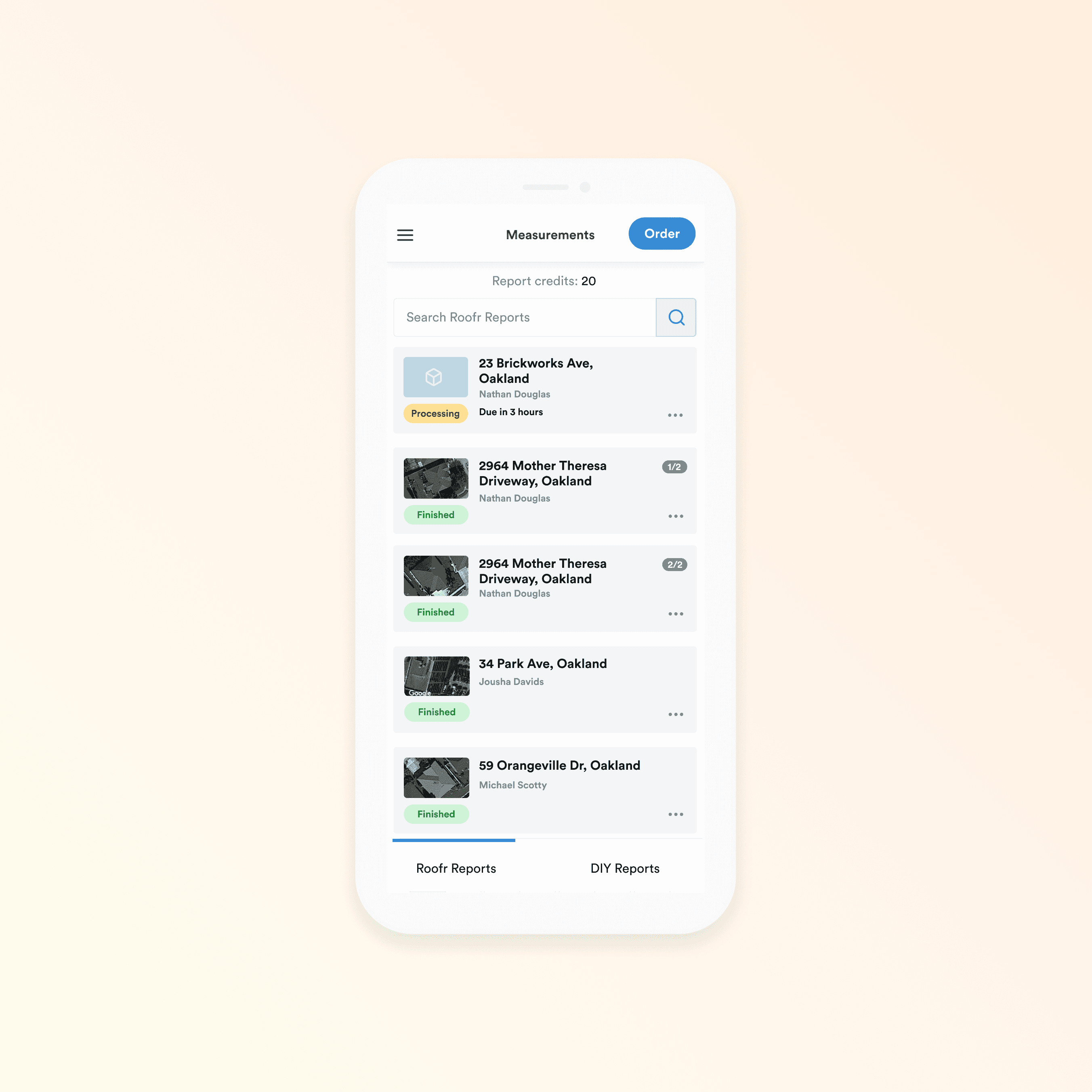
Users couldn’t distinguish between reports they generated themselves (DIY) and those ordered from Roofr.
The main call-to-action—“Order a Report”—was buried, which directly impacted conversions.
Support and workforce teams were working in cluttered views, filled with columns that didn’t reflect their day-to-day needs.
And from a brand standpoint? The visual inconsistency eroded trust and made the app feel unfinished.
The page was widely used, but the experience felt like an afterthought.
Advocating for internal teams
Originally, the focus was only on the customer-facing view. But at an offsite, I spent time with the support team and saw just how frustrating the admin view was in practice.
So I asked to shadow them. I learned what information actually mattered, which columns were useful and which weren’t.
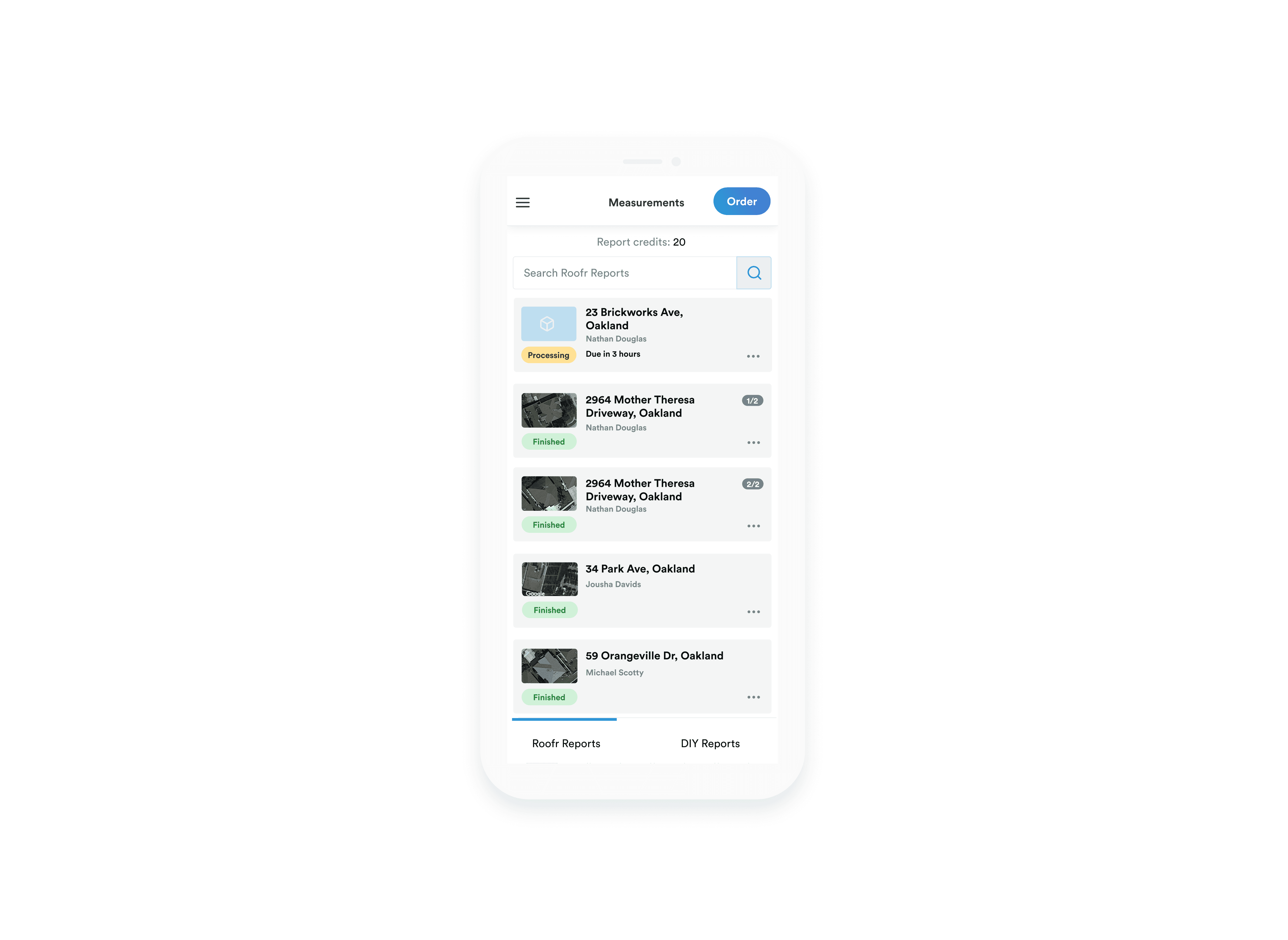
From that, I designed a streamlined version of the Measurements List just for internal teams—one that was:
Simplified to show only relevant data
Visually organized for faster scanning and fewer mistakes
Easier to teach, helping reduce the learning curve for new employees
Even though the redesign wasn’t scoped initially, once engineers started implementation, they realized the internal and customer views shared the same codebase. We couldn’t fix one without touching the other, so we fixed both.


Outcome
For customers:
✅ A cleaner, easier-to-navigate interface
✅ A clear CTA that increased report orders
✅ Fewer support tickets, thanks to reduced confusion
For internal teams:
✅ Streamlined workflows that sped up everyday tasks
✅ A more trainable tool, with less cognitive overhead
✅ Increased satisfaction and fewer workarounds
“Made training new employees much easier.”
– Lindsay, Support Team Lead
What I learned
Don’t wait for permission to improve what matters.
This wasn’t a roadmap item—it was a gut check. I saw a disconnect, took initiative, and brought alignment where it was missing.
Internal tools are user experiences.
Designing for the folks behind the scenes is just as important as designing for the end customer. Their efficiency affects the entire business.
Consistency builds trust.
An interface that feels cohesive—visually and functionally—reinforces credibility. The rebrand needed to live in every corner of the app, not just for new features.
Systems thinking creates long-term value.
Introducing a reusable colour palette and consistent components into the design system had a ripple effect across the product, establishing clear visual hierarchy and making tasks much easier for users.
Impact
The Measurements page redesign helped improve both user engagement and internal efficiency. But it was just one piece of a bigger puzzle.
As the product matured, I also contributed to launching foundational features like subscriptions, proposals, teams, integrations, jobs, leads, and the Instant Estimator. Together, these efforts helped drive:
📈 3,500+ new subscriptions within 9 months of launch
💰 Revenue growth from $4M to $10M in just one year